ROLE
UX Designer
CLIENT
Personal Project
Craigslist
Improving Craigslist for an easier and smoother mobile experience
OVERVIEW
Making Craigslist more accessible and user-friendly.
I redesigned Craigslist’s mobile experience to help users easily sign in, find jobs, and navigate the menu. Understanding how overwhelming the platform can feel on smaller screens, especially for new users, I wanted to make the process more intuitive. Throughout this project, I focused on:
-
-
- Conducting user interviews and analyzing mobile usage behavior
- Identifying pain points and defining the main challenges users face
- Creating wireframes and a functional prototype to test and iterate, ensuring the solution was streamlined and user-friendly for everyone.
-
PROBLEM
Using Craigslist can be pretty frustrating, especially if you’re new to it.
Finding what you need on a cluttered phone layout can be really frustrating. You might get so focused on logging in or searching for job listings that you miss great opportunities right in front of you.
For many users, especially those unfamiliar with the site, this makes the experience more frustrating. I had to make the process smoother and more enjoyable.
Imagine if navigating Craigslist was as simple as a few taps on your screen.
PROCESS
Research
First, I researched similar websites to Craigslist, such as eBay, Facebook Marketplace, and other e-commerce platforms. I aimed to understand their user flows and key features to identify the most important elements that could enhance the Craigslist experience.
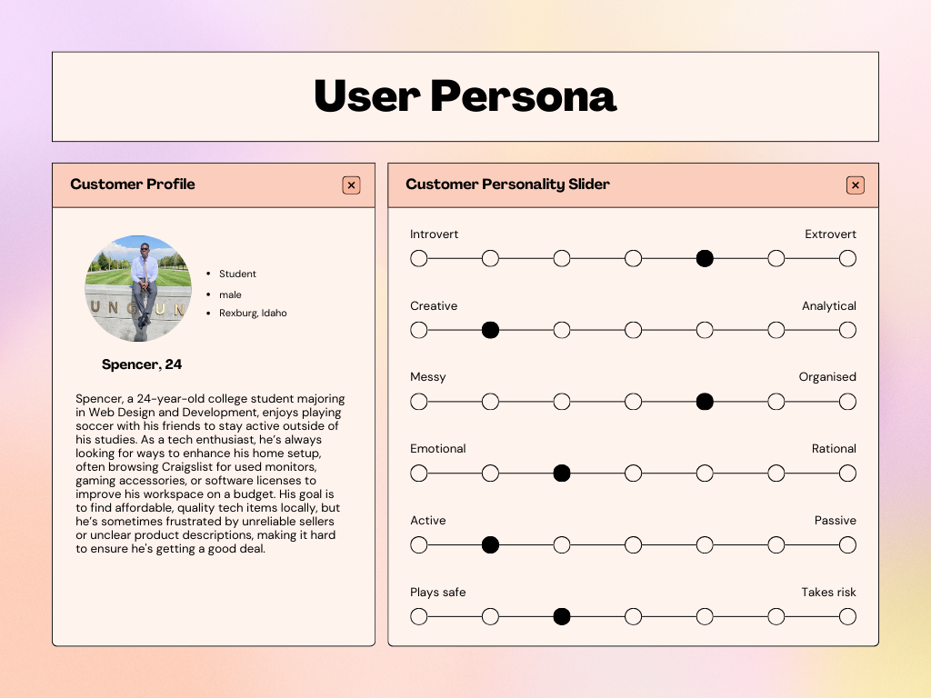
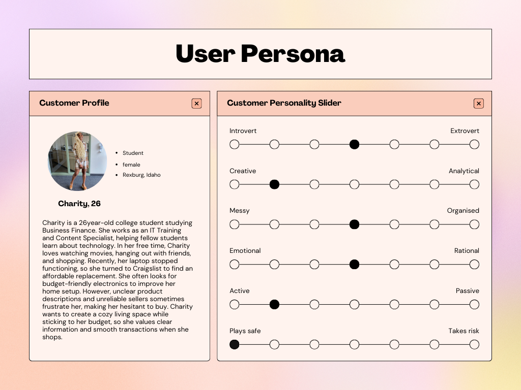
USER PERSONAS
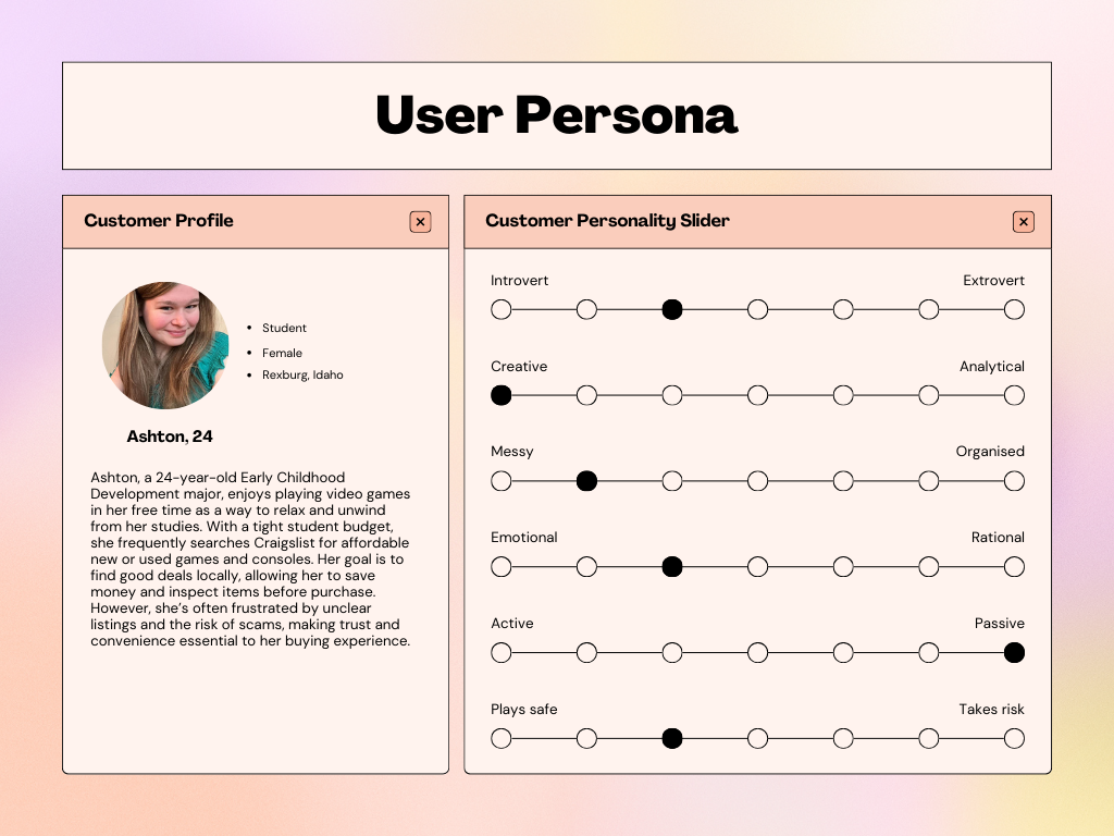
I developed user personas to understand Craigslist users better. While my primary focus was on individuals buying and selling items, I also considered users looking for jobs and renting services. This approach provided a broader understanding of the platform’s features. Ultimately, my design aims to enhance the overall user experience for those interacting with Craigslist
USER FLOW
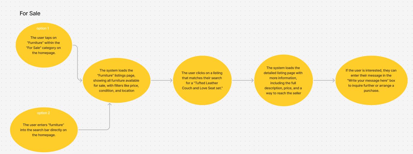
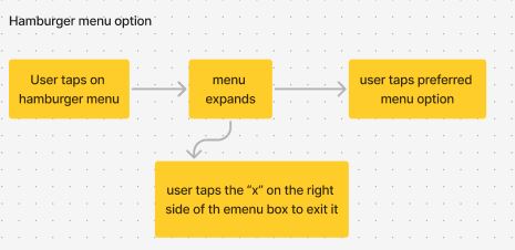
Making the user flow for the Craigslist mobile redesign helped me see how users will use the app. It focused on three main tasks:
- Signing In: Users start on the homepage. They can click to sign in or create an account. After logging in, their name shows instead of the sign-in button.
- Searching for an item to buy: Users can search for items in the ‘For Sale’ category from the homepage or even use the search bar. They can browse through search results and view detailed information about specific listings by clicking on the items.
- Exploring options: Users can return to the homepage to browse different categories and manage their accounts.

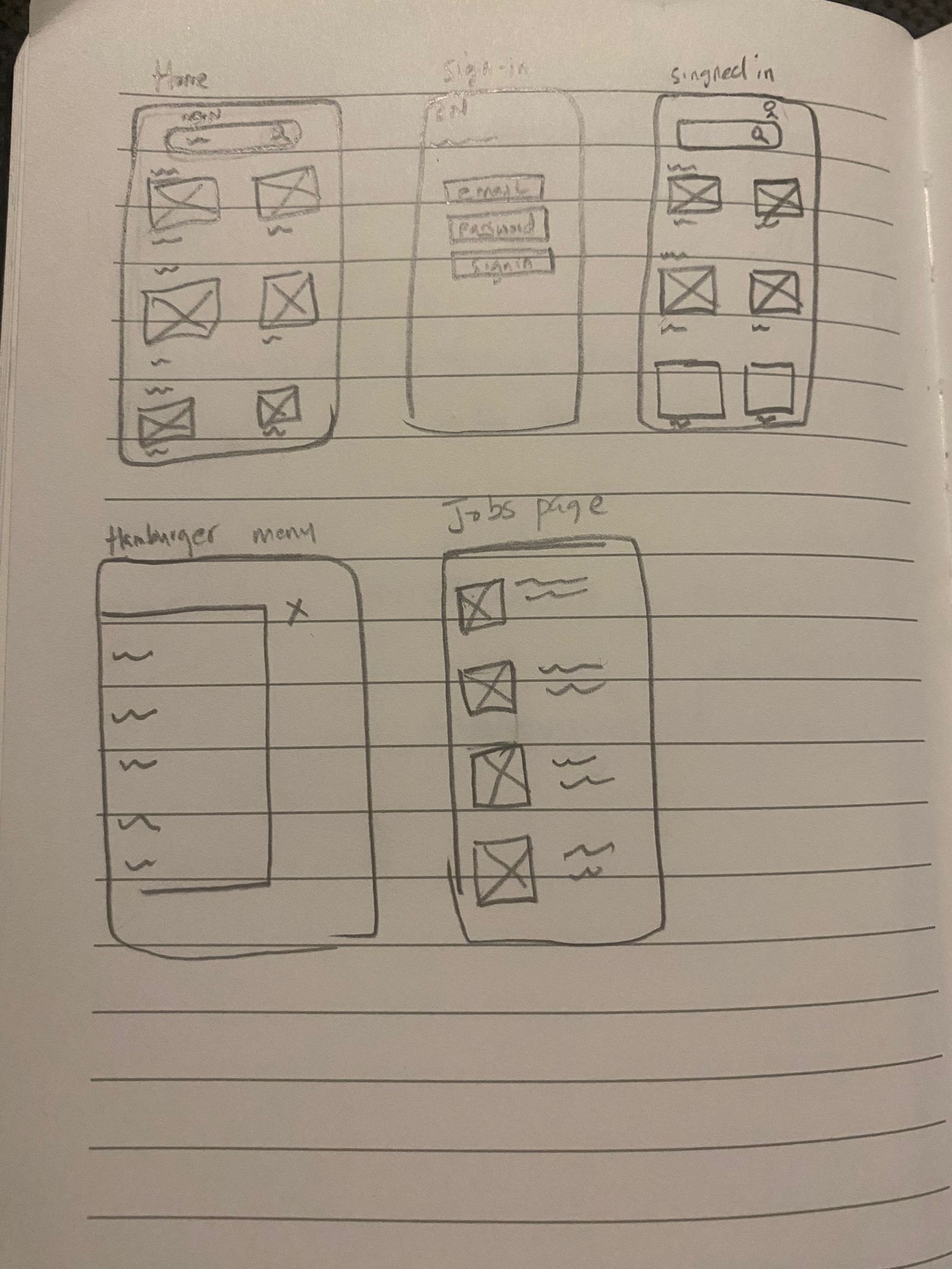
SKETCHES
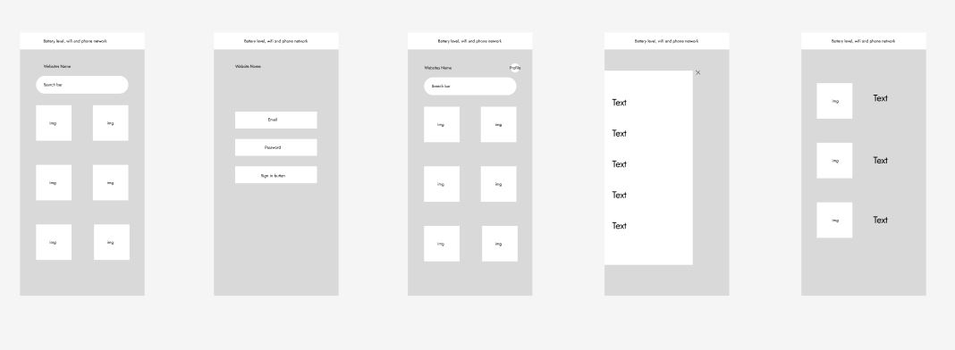
WIREFRAMES
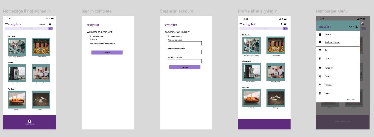
Refined Wireframes
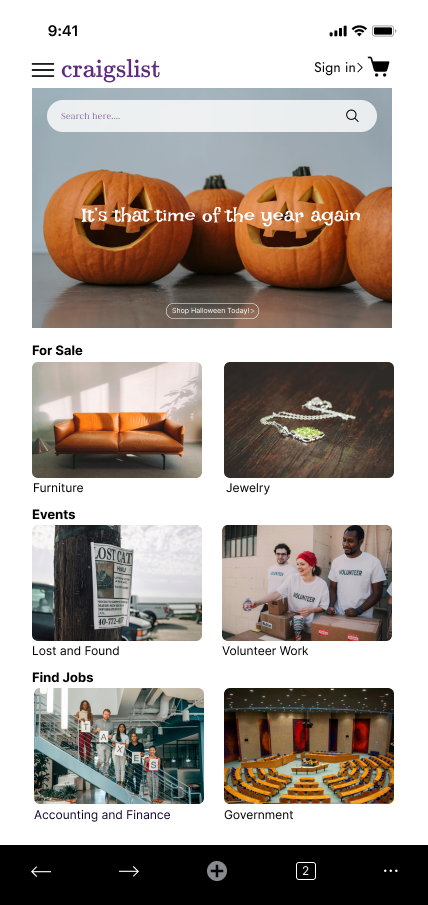
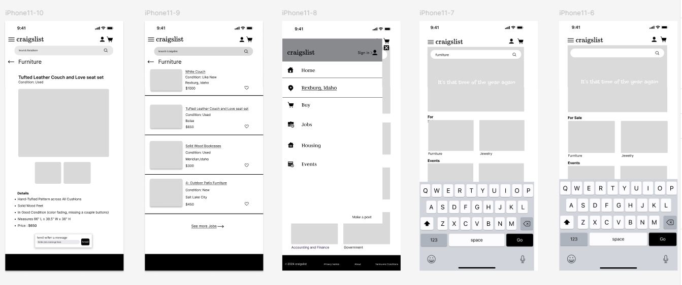
After conducting interviews and user testing, I created this updated wireframe for the Craigslist-like platform. The feedback gathered during these sessions led to several important changes to enhance the user experience. I made changes to the visuals, ensuring important information stands out and is easily readable. Also, users indicated a need for a more straightforward search process, so I refined this feature to make it easier for them to find desired items and connect with sellers.
User Testing
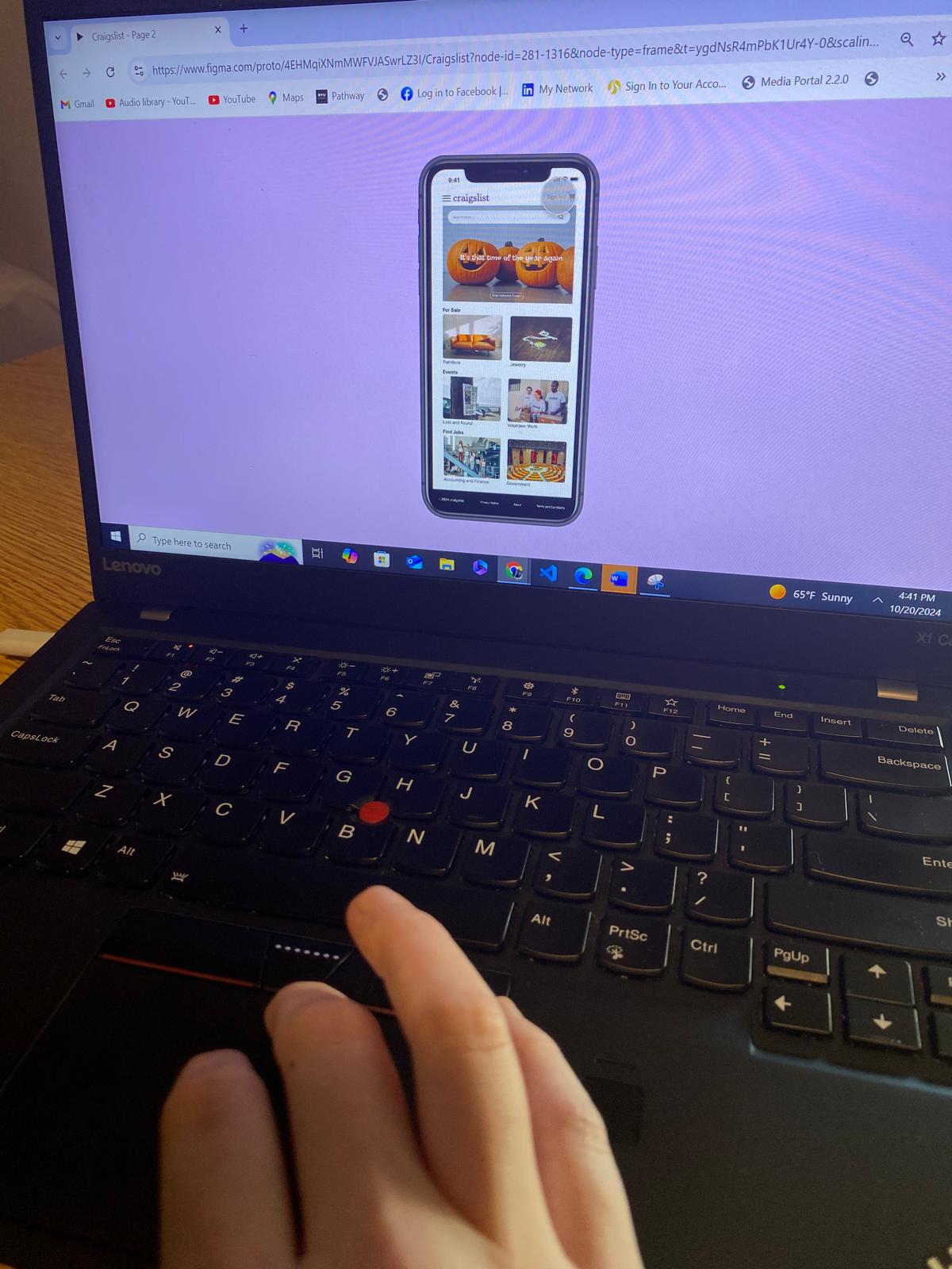
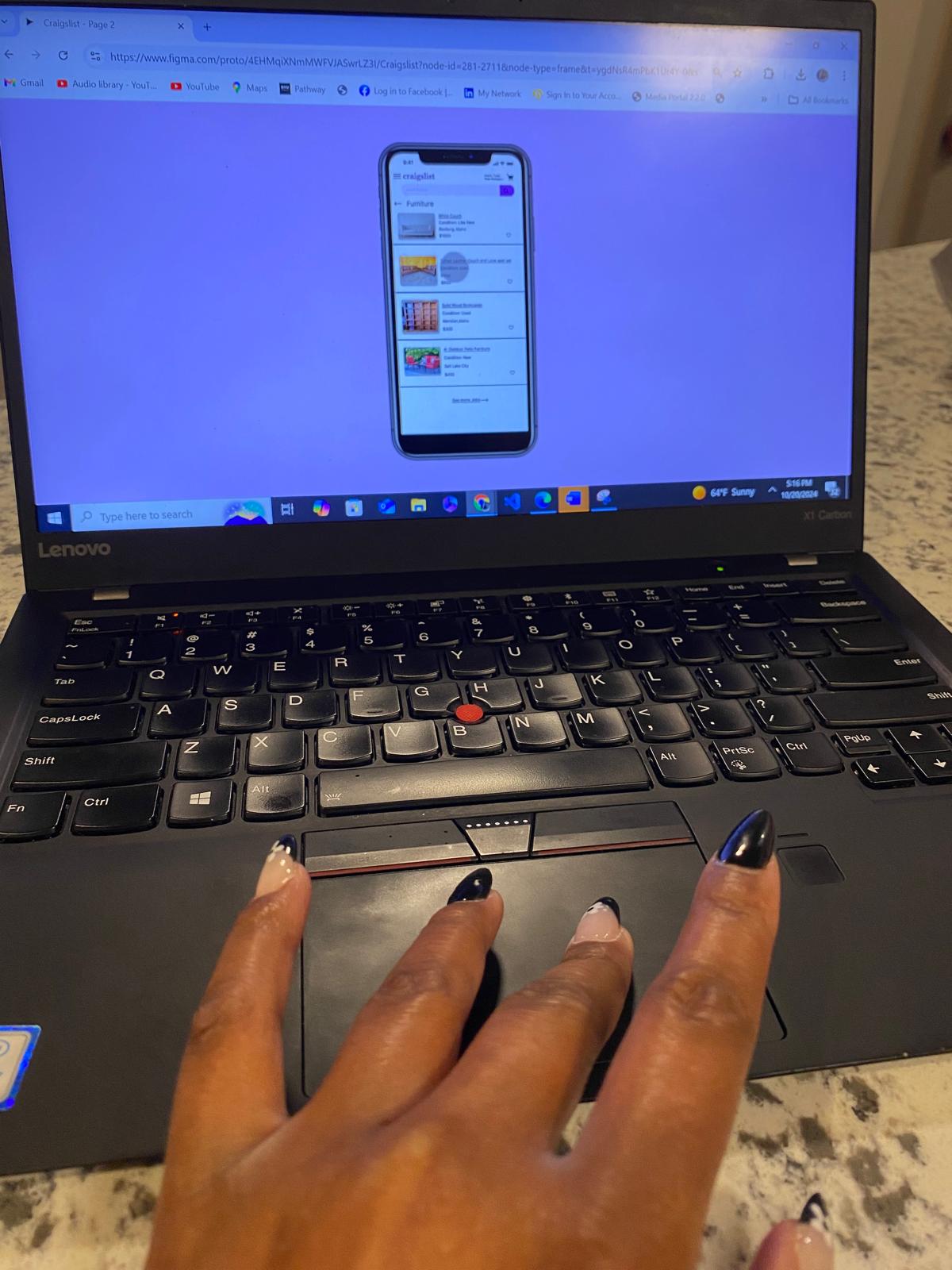
User testing revealed several key insights for Craigslist:
1. I needed to streamline the login process to reduce user frustration and improve access.
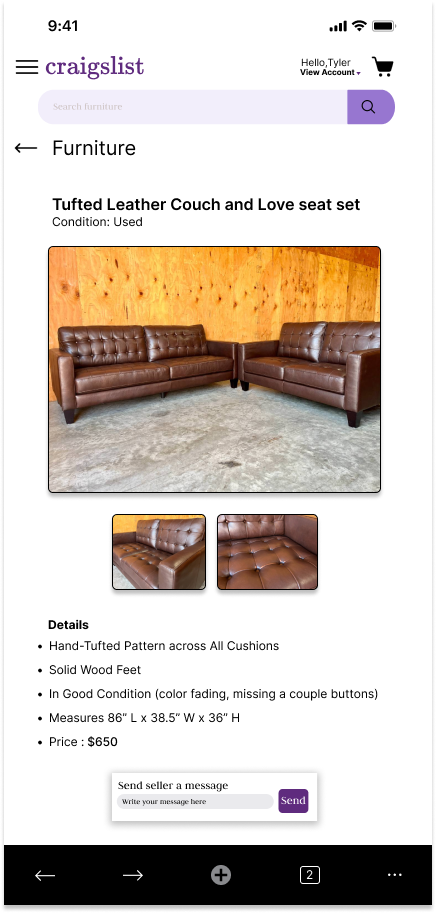
2. I needed to enhance the search functionality and navigation to help users easily find furniture listings.
3. I needed to improve the visibility and usability of the hamburger menu to facilitate access to other options.
These findings prompted me to refine the user interface, focusing on usability and enhancing the overall user experience.
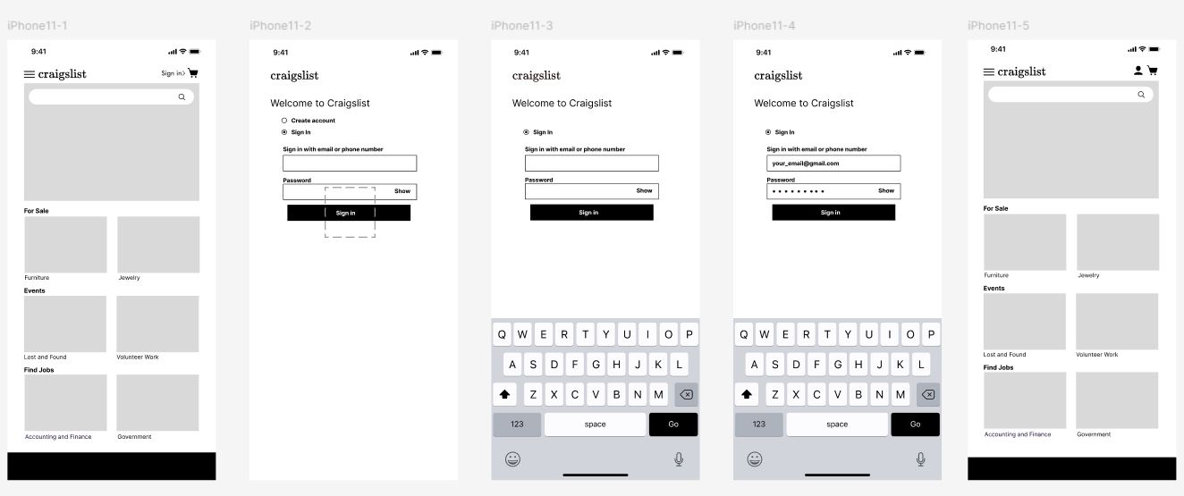
Final Wireframe Overview
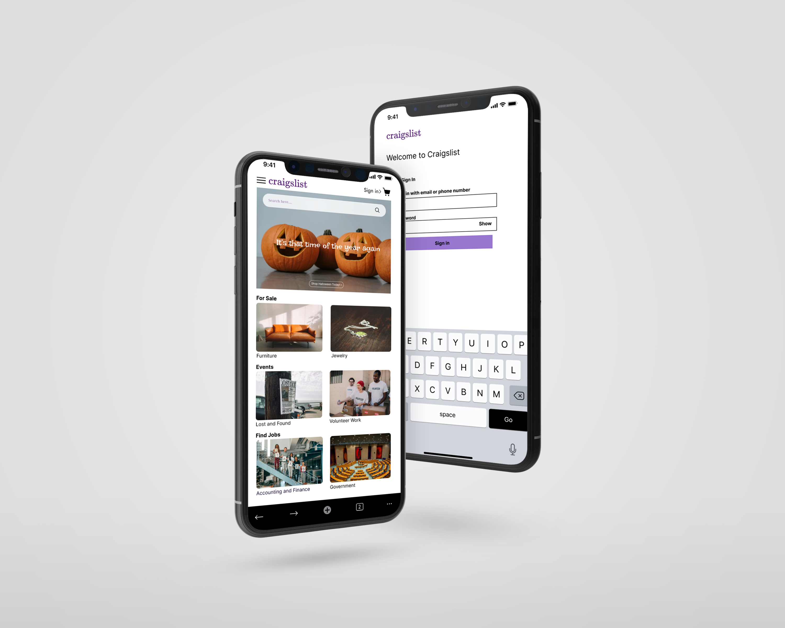
After three rounds of user testing, I’m excited to share the final wireframe for the Craigslist-like platform. The tests helped me make important improvements:
- Easier User Sign-In: The sign-in process is now simpler, so users can log into their accounts quickly.
- Better Search Functionality: The search feature is easier to use, making it simpler for users to find what they want and talk to sellers.
- User-Friendly Hamburger Menu: The hamburger menu is better organized, helping users explore options more easily.
Key Achievements:
- User-Focused Changes: I added feedback from users to improve the design and make it more user-friendly.
- Improved Navigation: I made it easier for users to sign in, search, and access different options.
- Clear Design: The layout highlights important actions, making it simple for users to interact with the platform.
This final version shows my dedication to creating an easy-to-use design and lays a strong foundation for future work.

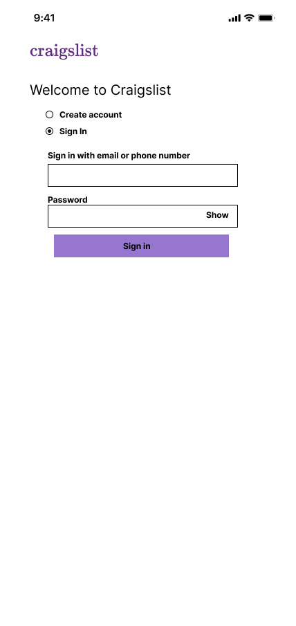
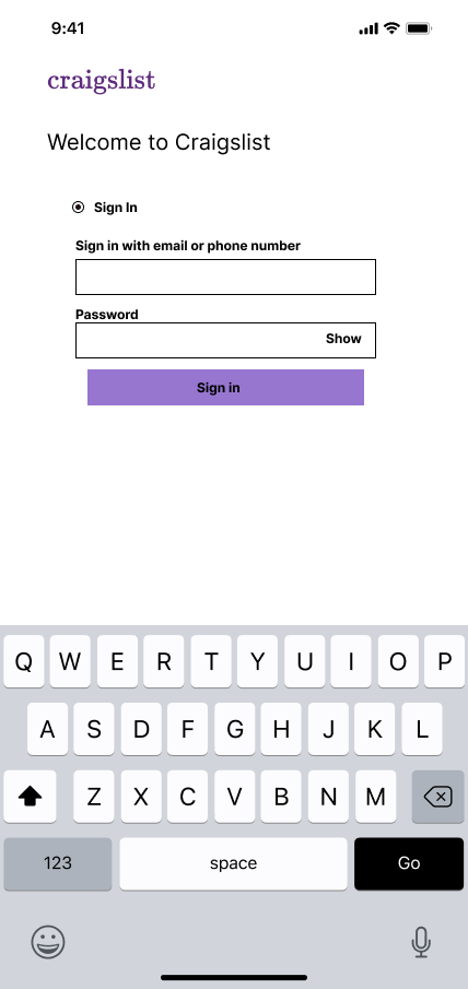
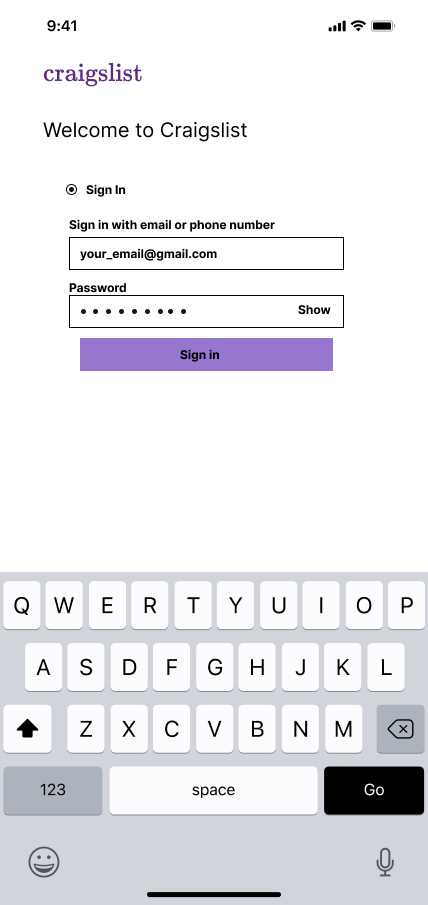

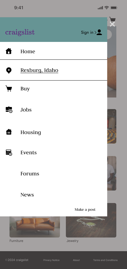
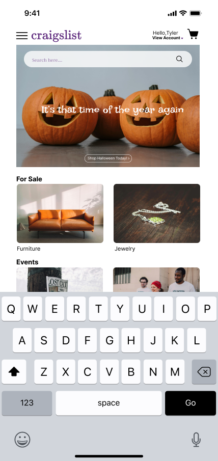
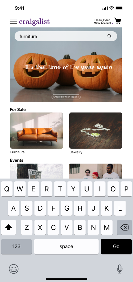
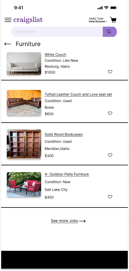

After my very final user testing, I was able to make changes to the wireframe. I changed the bottom of the page to include the back and forward arrows instead of the footer from my previous design.

